David Hockney Photo Joiners
|
David Hockney is an English painter, draftsman, printmaker, stage designer, and photographer. As an important contributor to the pop art movement of the 1960s, he is considered one of the most influential British artists of the 20th century.
In this lesson we were looking at David Hockney's Photo Joiners. This was when he took many photos of the same things using different angles and perspectives to create a full image, in the style of Cubism.
|

|


I love the way that Hockney uses multiple angles and perspective to create depth and draw your attention to a picture that would normally be quite simple. I think this technique creates interest and intrigue into the pictures drawing you in.
For this task we were asked to create photo joiners inspired by this collage effect. To create this I used photoshop to collage the images together and moving them around until I was happy with the composition of the pictures.
This was inspired by David Hockney's 'The Chair'
This was inspired by David Hockney's 'The Chair'

I think I was successful in that the object is clear and is quite even and matched but not so much that you lose the effect of the angles and perspectives.
Fireplace Photo Joiners

|
|
Homework Response
In this homework I was tasked to photograph the same thing from multiple different angles and perspectives to create a collage image later on.
|
|
|


|
|
|


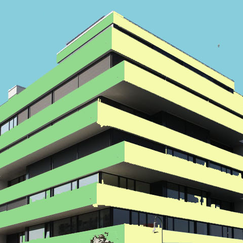
Simplified Image - Micheal Craig Martin


Sir Michael Craig-Martin CBE RA is an Irish-born contemporary conceptual artist and painter. He is known for fostering and adopting the Young British Artists, many of whom he taught, and for his conceptual artwork, An Oak Tree. He is Emeritus Professor of Fine Art at Goldsmiths.
In this task we had to use an image of a building and following instructions set by our teacher we were showed how to simplify the image into block colours. I found it interesting how the multiple different colours averaged out into one continuous colour and how different the colours look next to each other compared to in ordinary form. I found it difficult to make sure you didn't miss parts of the photo and had to go over it multiple times.
|
This was how I did it ;
|
We were then tasked in creating a GIF that showed the transformation from the original image into a simplified image.
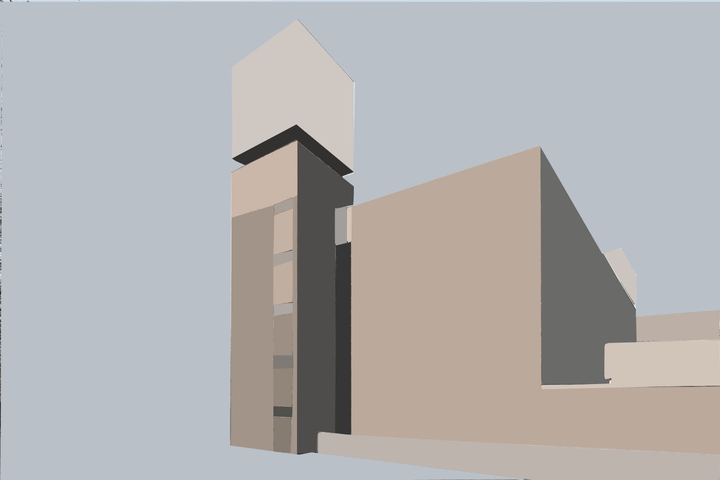
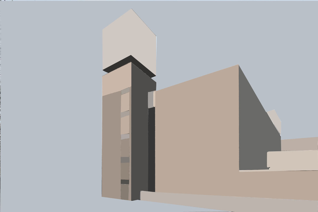
Mixed Architectural Image
In this lesson we were tasked to use the work of Paul Eis to create mixed architectural images, we had too first look at the four images provided and choose one that you want to change. Then using the tutorial change the building so parts of it so that they are in a bright vibrant colour.
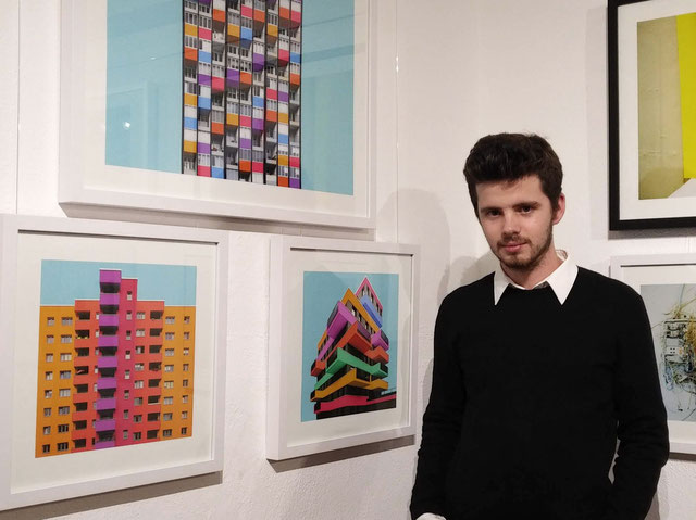
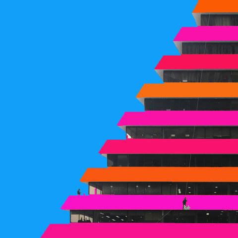
Paul Eis
|
He was born 1998 in Berlin. After finishing school in 2016 he moved to Austria to study architecture at the University of Arts and Industrial Design Linz.
He was interested in architecture since my childhood. he always had a fascination for towers, bridges and other spectacular buildings. Later, when he discovered photography, he got more into architecture and the built environment around him. |
|
We were tasked to take an ordinary architectural image and add colour creating interest and an eye catching image.
These were my steps on photoshop;
Here are the finished examples of my work;
|
|
What went well in this task was the colours are bright and stand out mirroring the work of Paul Eis yet they could've been improved by improving the accuracy of the colouring.
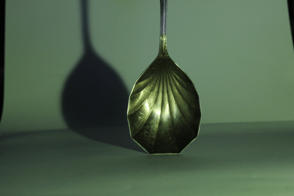
Andre Kertesz - Form over FunctionAndre Kertesz was a Hungarian photographer who emerged as one of the most influential photographers of the medium. Favouring an emotional impact over technique, he famously remarked, “I just walk around, observing the subject from various angles until the picture elements arrange themselves into a composition that pleases my eye.”
Simple subject matter such as forks resting against the rim of a bowl placed on a table allows Kertész to focus on the composition of the photograph. He uses the natural beauty of the fork's simple shape and form to elevate the photograph above a simple record of kitchen utensils into a poetic statement. |

|
Here are some of my favourite examples of his work ;


These are the images from our first response. We were given a white backdrop, a torch and some forks to try and create an image inspired by Andre Kertesz
Theses were my favourite images that came from this shoot.


What went well in this shoot was that I got many different angles and experimented with shadows and light. I could've improved by making sure my images weren't too dark.
Fork Second Response
In this shoot were were using different subjects to photograph allowing for more experimenting with shadows and highlight and creating different affects with the light.


Fork Third Response
In this response we were using coloured light and torches to create different shadows and highlights in colour.


I then took the images and turned them into gifs using a gif making website.
|
|
What went well in these responses was the different sources of light both coloured and white and I especially enjoyed the Gif making as it allows the pictures to come to life.
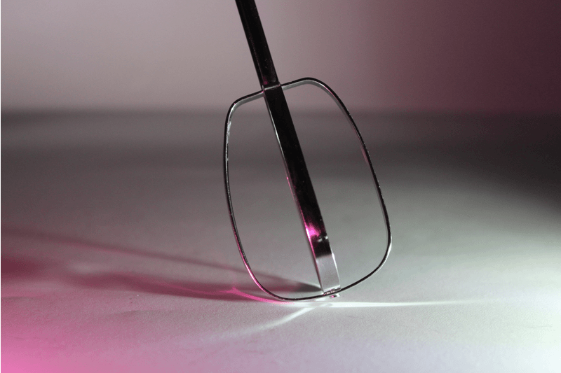
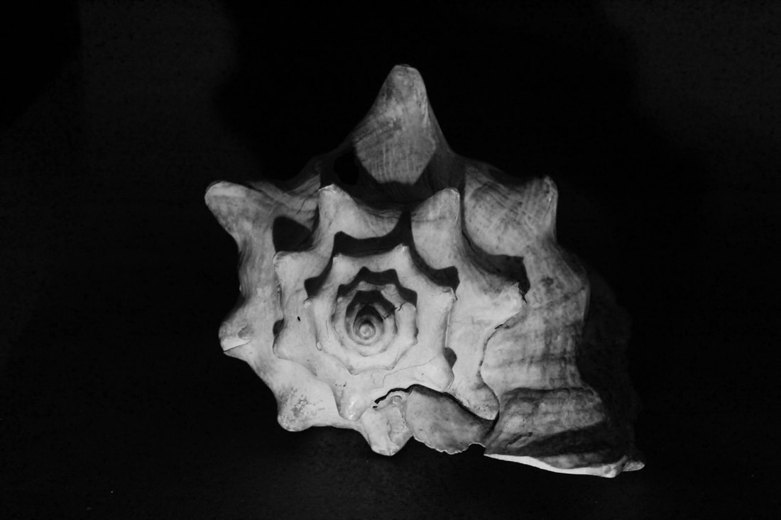
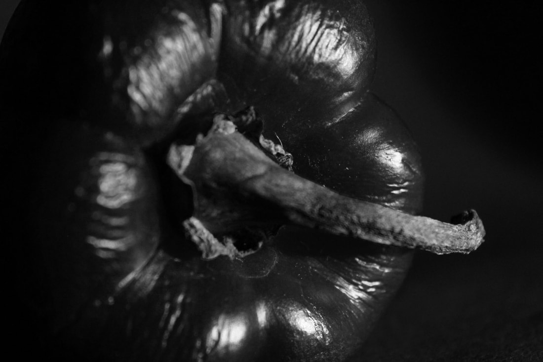
Ordinary to Extraordinary - Edward Weston
|
Edward Weston was a 20th-century American photographer. Over the course of his 40-year career Weston photographed an expansive set of subjects and over the next two years he produced nearly 1,400 negatives using his 8 × 10 view camera. Some of his most famous photographs were taken of trees and rocks.
In this task were were told to use ordinary everyday objects and inspired by the work of Edward Weston, create extraordinary images through the use of aperture and natural light. Here are some examples of his work; |

|


These were the images of my first response. We were photographing shells and peppers
I then edited the images using the levels and brightness tools to create the affects that I desired.


What went well in this project was that I got many close up images of different objects, yet what I could improve on is experimenting more with the light and angles.
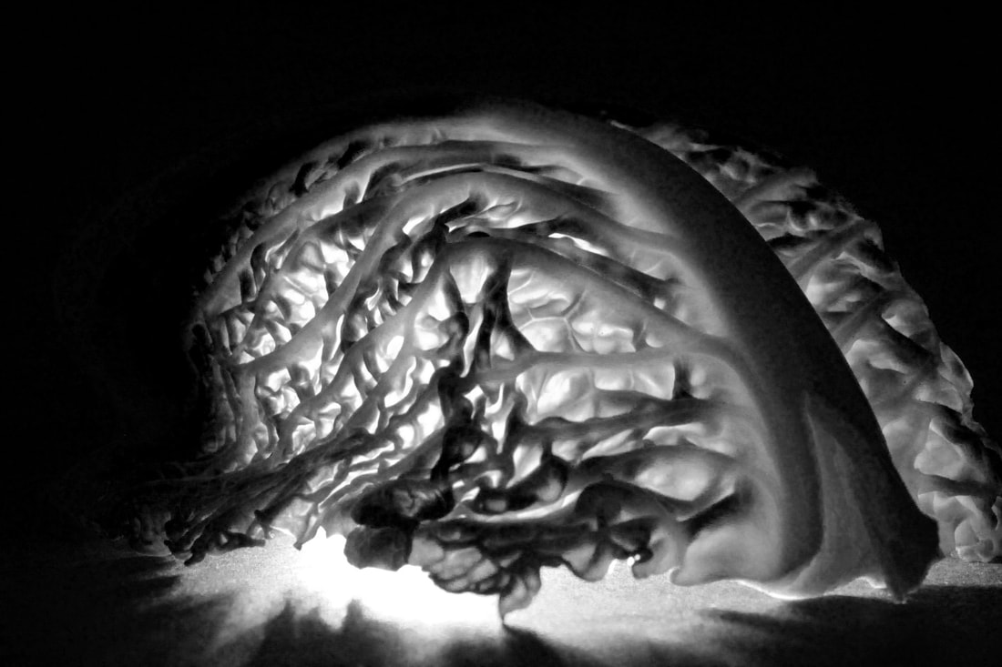
Second Response
I think this shoot went well as we used many different angles and objects to create extraordinary images from ordinary subjects. I think it would be even better if I could incorporate multiple objects in the same shot.
|
|
|


These were my black and white edits of a few pictures that I found very interesting.

|
|
|
|
I love the way the torches create light from whatever direction or angle you like, as it allows you to play around with the photos more and create more obscured, interesting images. I prefer the way these look to the natural ones as they are more fun and you have more freedom to chose how you want your photographs to look and have more creative freedom.
Sharon Radisch, the NYC and Paris-based photographer, art director and artist, circumvented a traditional path to a career in the arts. As she witnessed the cohesive nature of organic life, she felt drawn to the minute mechanisms of cells in isolation. For several years, Sharon applied this interest in interaction to her work in the medical field. After long days in laboratories, she sought solace in creative practice and began assembling sculptural still life to photograph. Soon her creative practice blossomed into a full-time career as her unique compositions resonated with a growing social media following. Now with over eight years of professional photography experience, Sharon sees a parallel between her biological and artistic work.


In this task we were asked to create lockdown sculptures using everyday objects to create interesting shapes, contours and points of focus in the frames. We had to ensure the background was all white and the objects were in focus.


What went well in this response was the use of different angles although this did allow for the background to become too distracting and took away from the affect of the picture. It would be better if I could've photographed more sculptures rather that focusing mainly on just one.
Second Response
In this response I was aiming to create images with a clear white background and using different sculptures that I'd made.


|


|
I think these images were successful in creating a clear backdrop for the sculptures and by using cropping and brightening the images on photoshop I was able to even better create the picture I was aiming for.
Jan Groover
|
   |
Half Term Assignment
In this assignment we were tasked with using items in a kitchen sink to create interesting images with multiple shapes, textures and mediums. I enjoyed the set up of this task and the freedom to choose what you can photograph. I found it difficult experimenting with different angles but I think I managed it well.


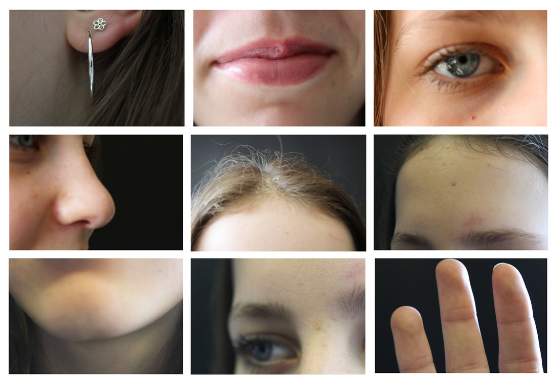
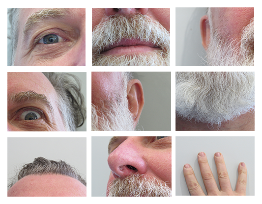
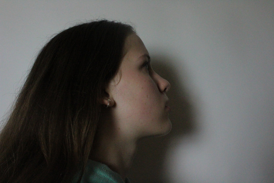
Different Views of a Person
Different views of a person - First Response
|
What went well in this response is my editing on photoshop and I had many different views of the models like the inspiration image. Even better if I could've used more angles and cropping to create more unique images.
Homework Response

|
|
I enjoyed photographing these images focusing on the details of someones face and using different expressions and angles to show the different parts of their faces.
|
|
illustrator & Digital Photographer Alberto Seveso was born in Milan, he grow up in Sardinia but is now working and living in Bristol (UK) as a freelancer. His passion for graphic art started when he was in a young age and he was really fascinated by the graphic of skate decks and the cover of music CD of metal bands in the early ‘90s. From this passion he started to create his artworks.
|

|


Fireworks In a Jar
In this task we were asked to create work inspired by Alberto Seveso using a cup of water mixed with food dye ink and oil. We used a fast shutter speed on Tv setting and a high ISO to create these.


I then chose my favourite images and then turned them into GIF's


What went well was using a little amount of ink and using a fast shutter speed yet they could've been improved by using continuous shooting
Fireworks in a jar, Second Response
In these responses we were using no oil and ink rather that food colouring to create the same affect.
After taking these photos I chose my favourites and turned them, into GIF's and edited them to my liking.


In these images I used the burn and dodge tools to create shadows and highlights in the pictures. Additionally I used the brightness/contrast tools and the levels tools. I think this was successful in the second image specifically with highlighting the pink colour to contrast the blue, this draws your attention to the colours and makes them pop.


In these images I also cropped but less and I again used the brightness/contrast tools and the levels tools. I like the way it focuses your attention more on the colours and makes them stand out.
|
One morning while eating a bowl of cornflakes I noticed that every cornflake within my bowl was unique some what like a snow flake. I decided to photograph every cornflake within a 500g box to show off their individuality and also answer a nagging question in my mind “ how many cornflakes are in a box of cornflakes? Over the course of a week I photographed every single cornflake within a 500g box, my original estimate was around 3000 but I soon realised this was way off and the final count came too 7122 cornflakes.I created a stop frame animation of all 7122 cornflakes for you to enjoy.
|
|
Lockdown Sequences
|
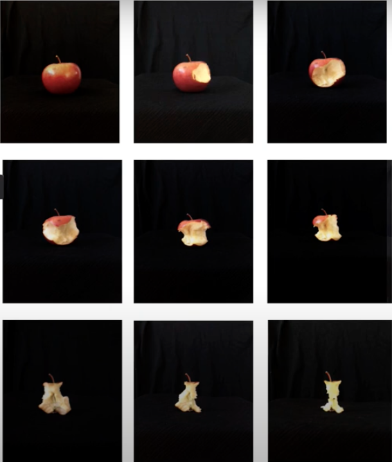
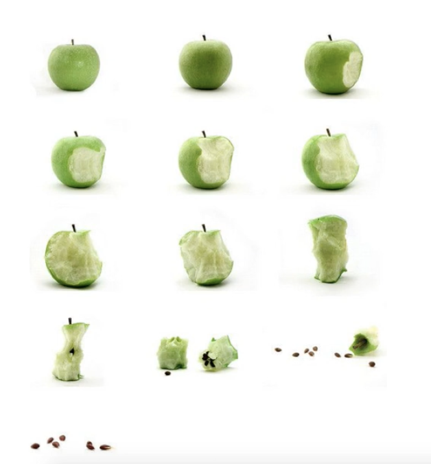
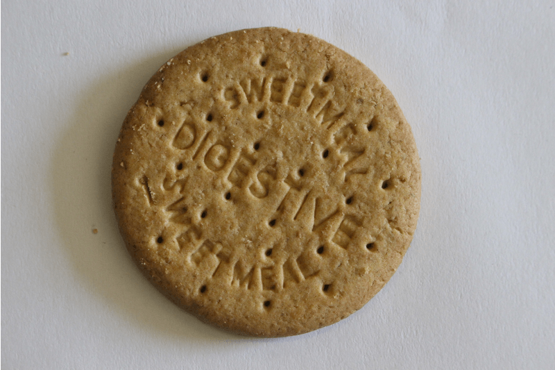
For this lesson we were tasked to create a lockdown sequence. We had to use a biscuit and picture the process of it being eaten. We would then use these pictures to create a sequence on photoshop, resulting in one complete image sequence.
We had to ensure that the camera stayed in the same place, the biscuit didn't move too much and the lighting matched. |
|
|
In my edits I adjusted the brightness, contrasts and levels. I then added them into photoshop on separate layers, and once I was happy with the layout I flattened and saved the image. I subsequently made a gif to go with the sequence of the biscuit breaking down.

|
|
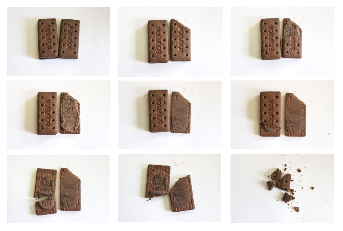
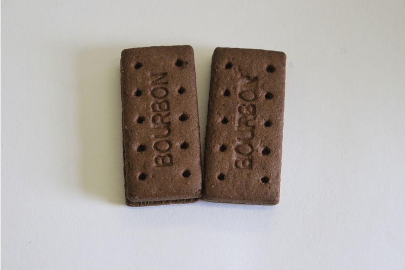
Second Response
For this task we were asked to create a sequence and a gif using two bourbons interacting with each other. I used the same skills in photoshop and gif maker to create these.
|
|
Independent Element
In this segment of work we are able to choose two sections of our previous work to develop independently in school and at home.
I decided on Different Views of a Person and Different Perspectives, Exploring both physical and digital collage. I will use cropping, editing and collage tools in photoshop and layering and collage physically.
I decided on Different Views of a Person and Different Perspectives, Exploring both physical and digital collage. I will use cropping, editing and collage tools in photoshop and layering and collage physically.
For this section I have chosen to replicate and take inspiration from Jesse Draxler an American visual artist, illustrator and art director.
My first response was a digital version. I used photoshop tools at home to create this affect using layering, cropping and erasing
|
What went well in this shoot was that I was able to create a black and white image that resembles the style of Jesse Draxler, yet to be more successful I think I should draw on the more abstract collaged sections of his work.

|

In this shoot I think as I had given myself a clear goal to work to I was able to create something closer to the style I desired. I am pleased with this a I think it shows my inspiration and I worked well to my goals from last shoot. I was happy with how my arrangement and cropping/erasing of the images went as I think it is effective in creating the desired affect.
|


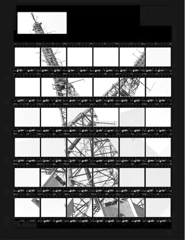
Thomas Kellner
These were my first attempts at a photo joiner of Alexandra Palace;
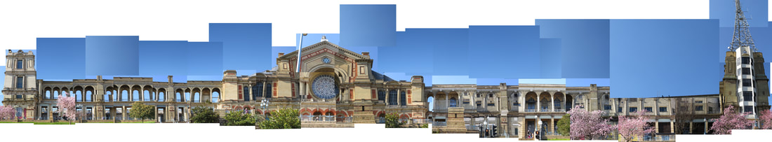
After creating this one I decided to create one ,with direction from my teacher, one with more sky and white space.

|
|
